Quite a few of the most prominent design trends of the past, such as mobile versions of websites and text-heavy pages, are dying a rapid death. As they go, several alternatives are popping up to replace them. While designers explore these options to find what works best, there are a few that have risen to the top.
These new design trends are a perfect combination of beauty and functionality, taking future technological developments and usage into consideration; making them highly likely to stay around for a long time to come.
Here are a few trends that will be sure to stand the test of time as technological devices and gadgets evolve over the next few years.
Flat, Simplified Layout
Web design used to be about getting things to look as realistic as possible, otherwise known as skeuomorphism. Note-taking apps would be ruled, just like the physical notebooks we use. Digital keyboards would have the same QWERTY layout. Images and buttons on web pages would have shadows and gradients to make them seemingly pop up from the screen.
Now that technology and web browsing have matured, people are a lot more open to changes that focus on functionality and aesthetics on screen, not just how something looks in real life. Flat design removes all of the complicated textures, patterns, shadows, bubbles, gradients, and other shiny effects to focus on the content and layout.
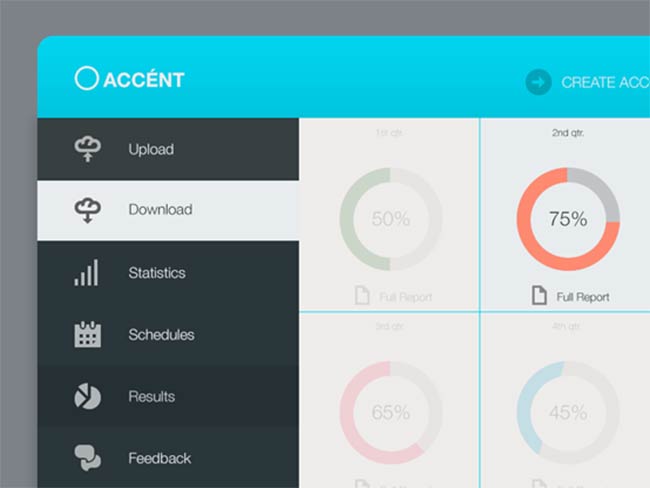
The way flat design was introduced – as a natural evolution of design working seamlessly with other trends such as minimalism and responsive design – makes us believe it’s here to stay. It will change a bit as we get more comfortable, as all design trends do, but it will only get better.
Prominent Social Media Icons
Social media connects people in a way that never existed before. It gives persons, businesses and media entities the ability to spread news rapidly, give real-time feedback and even save lives.
Web developers started to include social media icons on websites because they realized that we were much more likely to revisit or favorite social network on a regular basis than to that website. Being connected to us on social media gave them to opportunity to ‘bring the mountain to Muhammed’.
Initially, these icons were tiny and placed in a far corner of the page – an afterthought. Now that so many people get the majority of news and daily updates from social media, it has become one of the primary marketing elements for businesses. A greater focus on social means larger, bolder icons that get your attention the moment you visit their website. We also see them at the beginning and end of many blog posts, below YouTube videos and on many landing pages, urging us to share the content we love with our friends on social media. Design houses like ElegantThemes, who have just released a powerful new plugin, are now focusing a great deal of effort on developing advanced and highly intuitive social sharing experiences for webmasters and visitors.
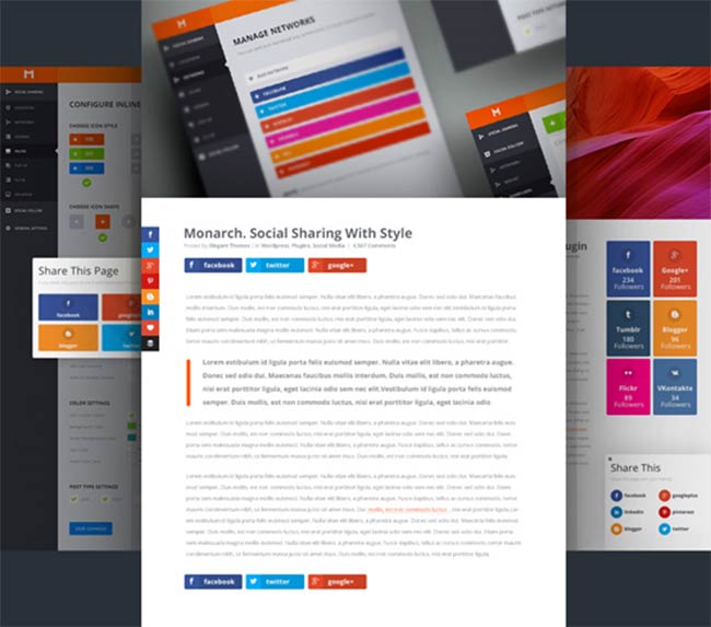
Since social media is hardly likely to disappear anytime soon, we’ll most likely be seeing social media get more prominent placement and become an integral part of Web design.
Bold Typography
Big, bold fonts make you stop and take notice. They can spruce up an otherwise boring page, or complement an image perfectly. In blog posts, they guide a user along, highlighting sections for those who wish to skim through or find something specific.
Newspapers knew this eons ago. They only have a quick second to grab your attention as you walk by a kiosk on the street. That’s why they have large, looming headlines above the fold on the front page.
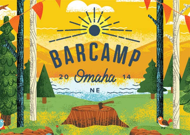
In the current age of over-saturation and short attention spans, websites only have a few seconds to get you interested before you leave for somewhere else – bold headings are part of their strategy.
The aesthetic appeal of a bold, unique font in a design is undeniable; yet the functionality of this typography – that is, it’s ability to pull the reader in and keep them on the page longer – is the real reason that large, bold headings are here to stay.
Large, Filtered Photographs
Earlier we said that bold typography is a part of a web designer’s strategy to grab your attention on a website – beautiful images would be the other part. To explain the effect of a large, captivating photo on a website would take more than 1,000 words. Images often convey what words can’t.
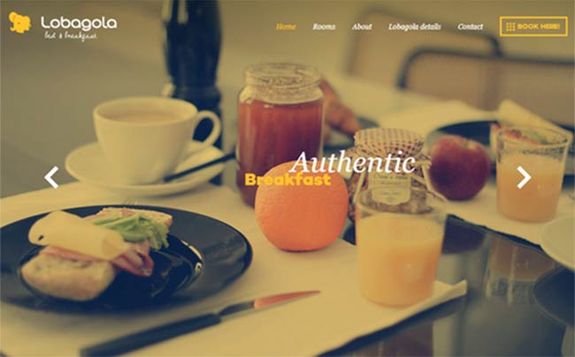
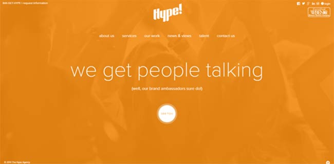
Nowadays, we’re not limited to photographs in their purest forms. Blurred backgrounds, textured overlays and colored filters, made popular by Instagram, are all used to give varied images a look that is cohesive, yet unique to the website.
Since this trend fits in perfectly with flat design, responsive layouts and bold typography, and research has proven that images get more attention than just words, expect to see images taking over.
Bite-Sized Content
There’s too much information online, with more being added daily. Since our available time in the day to consume this content stays the same (or reduces), we have to be very selective about what we consume. The phenomenon of persons opting out of reading articles and posts solely on the basis of length had spawned its own abbreviation, ‘tl;dr’, short for ‘too long, didn’t read’.
To combat this, websites are moving away from lengthy, detailed pages and focusing more on easily digestible content that gets to the point and highlights the main desired action. Articles and blog posts have shorter paragraphs broken up by images and large pull-quotes. Where possible, words are being replaced by video or audio so persons can multi-task.
This trend is the only one on this list that was born out of necessity based on public behavior, rather than design evolution. While well-researched long form content has its place online, bite-sized content will be most prevalent and will continue to thrive for as long as we keep flaunting our short attention spans.
The best part about all these trends is that they are extremely easy to implement, even for non-design professionals. Marketplaces and web design solution providers like IM Creator, who offer powerful yet easy to use and intuitive web design tools and free templates and Themeforest, a huge database and marketplace for WordPress and other themes are revolutionizing the web by empowering anyone to build beautiful presences online – eliminating the need to be an advanced coder or designer. We anticipate that things will only get more exciting as technology makes design simpler.
5 Striking Web Design Trends That Are Here to Stay,


Timothy
Nov 20. 2014
The appearance and functionality of a web page goes a long way into determining whether or not the site will attract the required traffic. It is, therefore, important to ensure that the content is appealing and easy to access for visitors to the page.
Jacelyn Richards
Nov 25. 2014
Obviously those are they are going to be the crucial web design techniques in 2015 and beyond since flat design, with its prominence on white space, clear typography and bold buttons, has the capability to make products shine, with no distractions to get in the customer’s way
John S
Dec 16. 2015
What’s up, I check your blog like every week. Your humoristic style is awesome, keep doing what you’re doing! Thanks!
Max
Feb 24. 2016
This is great advice and good examples. Thank you for posting.