New technology trends emerge every day. Some technology trends become so popular and important that they stay forever and change the way we work while others come and go like the breeze.
2015 has also arrived with new trends that have already created a buzz in the online market.
Here are some of the major trends to look for in 2015.
1. SVG images
SVG, scalable vector graphics, images alter themselves magically to fit the screen size and pixel density of variety of devices, thus appear good and beautiful on each type of device. However, currently wordpress does not support SVG images but there’s always a third party plugin available to solve the problem.

2. Responsive Layout
Responsive design is no longer an option; it has become the need of the hour. Today, even Google prefers responsive websites while indexing. A website must serve different users on different devices to build a strong online reputation.

3. Parallax design
Parallax design has proved that scrolling is way better than clicking. Parallax design has become so popular that nearly every website is implementing it. Scrolling insists your visitor to check out the complete website without pissing of. Better user engagement, smoother transition and reduced number of pages to explore are some of the benefits that come along with parallax design.

4. Moving background for interactive design
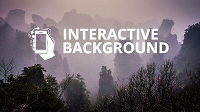
A majority of websites has already started using this new technology trend to stand out in the crowd. Paypal, Flipboard, Spotify and The Cassette are some of the popular websites making use of moving backgrounds. There are numerous free or premium wordpress themes available to give you this design pattern.

5. Ghost Buttons
You probably have seen ghost buttons on many websites and wondering what are they. Displayed with a simple contrasting outline makes them look elegant and classy. These restrained buttons are normally seen on landing themes and pages. You can either find them in many wordpress themes or create one for yourself with the help of little CSS.
6. Flat designs
Flat design is the simplest yet effective way to improve user experience on your website. Since flat designs are focus more on content and broader color palette, the designer has to deal less with pictures such as background textures.
7. Modular design
Information provided in small contained boxes look much interactive than in a broader self-contained box. This also offers better user engagement and provides a great opportunity to website owner to offer only useful information.
8. Infographics
Infographics are more interactive than plain text, since they are built by combining content, movement, colors, and images that draw user’s attention.
Author Bio:
Elvin Roy is a blogger who loves to share everything about wordpress web development and new design technologies initiatives. She currently works as a senior writer for Wordsuccor Ltd., Which is a WordPress Customization Company based in USA. Follow her on Twitter: @wordsuccor
